Tweaking my favorite programming font
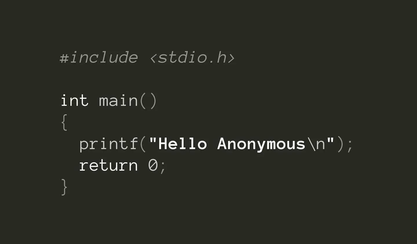
After trying out every monospaced font I could get my hands on, I decided that Mark Simonson‘s Anonymous Pro is the one for me:
After using it in my IDE for months, I decided to start using it in my terminals. Unfortunately, this revealed a subtle flaw in the font. Take a look:

Notice anything? Those forward slashes seem a bit too far to the right. While this wasn't a problem when writing code, it became a major eye sore when working with lots of paths in a terminal.
One interesting thing is that this issue only shows up when using the font at 12pt without anti-aliasing. This is because Anonymous Pro is a TrueType font. TrueType is an outline font, which means the designer draws each character by specifying vectors that define the shape. By using vectors, the font can be scaled cleanly to any size. At smaller sizes, the scaling of the vector outline may result in an image that isn't as clear as desired. To give the font designer complete control of the display, TrueType fonts can also have bitmapped versions of each character for specific point sizes.
Armed with this knowledge and a font editor (like FontForge), we can crack open the .ttf and see exactly what's going on with the forward slash:
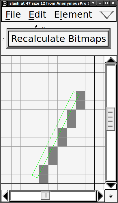
The green outline shows the vector representation of the character, while the dark squares show the pixels used in the bitmapped version. I think that the pixels should be shifted to the left by 1, so I went ahead and did it:
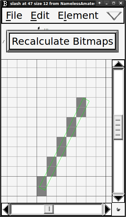
Now everything looks good in my terminal:

I've informed Mark Simonson of this and it looks like this fix may be available in the next version of Anonymous Pro.
When you consider how many characters there are to define and the various point sizes, it's clear that designing a font is a monumental task. We should all be grateful that such talented designers are out there and that some of them are generous enough to provide such useful, beautiful fonts for free.
On top of giving it away free, Mark Simonson has released Anonymous Pro under the SIL Open Font License. This means that you can enjoy my trivial tweak with minimal effort, because I'm allowed to redistribute my modified version. I'd prefer to call it something like “Anonymous Pro with Shifted Slash” or something equally descriptive, but condition 3 of the OFL says that I need to use a different name.
So, without further ado, I present Nameless Amateur! As soon as the update of Anonymous Pro is available, I'll remove this link and direct people to the new version.