Why You Should Try a Tiling Window Manager

What is a tiling window manager?

Window managers control the placement and appearance of programs on your screen.

Most popular window managers are what are called “compositing window managers,” which is what you are using by default in Microsoft Windows, OSX, Gnome, and KDE. They use the desktop metaphor, where each program is treated like a re-sizable piece of paper. You can move them around freely, change their size, and cause them to overlap.

In contrast, a tiling window manager is more like a well-organized drawer than a desk. The entire surface is divided into non-overlapping buckets where windows are displayed. If you’ve used pretty much any IDE, like Eclipse or Visual Studio, or a terminal multiplexer, like screen or tmux, you’re already familiar with this approach.

Why should I use one?

They’re efficient

Unlike most popular compositing window managers, tiling window managers really make an attempt at managing your windows for you. Instead of having you constantly reorganize the individual windows on your screen, you specify at a high level how you want windows to be placed and the window manager does it for you. New windows are intelligently placed based on the high-level directives you’ve already given.

Tiling also lends itself well to really efficient keyboard shortcuts. Because there’s an unambiguous arrangement, you can quickly do things like switch focus to the window immediately to the left, right, top, or bottom, as opposed to most compositing window managers where the best keyboard option is Alt-Tabbing through a linear list of all your windows:

They scale

With innovative features like tags (Awesome) and nested workspaces (ion3/notion), it’s possible to sanely deal with huge numbers of windows and workflows. You’re able to group and manipulate windows together in more sophisticated ways than you can in traditional window managers that limit operations to all instances of a single application or everything on a virtual desktop.

They’re customizable

Most tiling window managers are written by developers for developers. They tend to provide rich, well-documented APIs that expose hooks for everything you could want.

Which one should I use?

There are a number popular tiling window managers to choose from, but the most popular (based my totally unscientific polling) are:

My preferred window manager is notion and it’s what I recommend for anyone wanting to dip their toes into the world of tiling window managers. The main reasons I suggest it are:

  • Like most of the other options, it’s designed for keyboard use, but it has the best mouse support. You can resize frames, move windows across frames, and access context menus in the expected ways with the mouse. Eventually, you probably will stop relying on these things and do everything with the keyboard, but it really makes the transition easier.

  • Multiple applications can be put into the same frame and are made into tabs. This is possible with some tweaks to the others, most notably xmonad, but it’s built-in with notion and there are great shortcuts for switching between tabs. Do you remember what a revelation it was when tabbed browsing was introduced? Having the ability to use tabs to group and switch between heterogeneous applications is equally incredible.

  • It’s very stable. I’m still using 3 year old builds of ion3 on some of my machines and I never have any problems.

As of Ubuntu 12.10, you can simply apt-get install notion to install it. It’s also available in the repositories of a number of other distributions.

In some follow-up posts, I’m going to detail the tweaks that I’ve made to my notion configuration to improve my workflow.
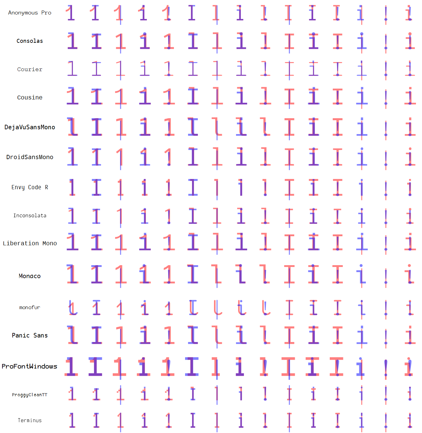
Tweaking My Favorite Programming Font

After trying out every monospaced font I could get my hands on, I decided that Mark Simonson‘s Anonymous Pro is the one for me:

Anonymous Pro Sample

After using it in my IDE for months, I decided to start using it in my terminals. Unfortunately, this revealed a subtle flaw in the font. Take a look:

terminal sample

Notice anything? Those forward slashes seem a bit too far to the right. While this wasn’t a problem when writing code, it became a major eye sore when working with lots of paths in a terminal.

One interesting thing is that this issue only shows up when using the font at 12pt without anti-aliasing. This is because Anonymous Pro is a TrueType font. TrueType is an outline font, which means the designer draws each character by specifying vectors that define the shape. By using vectors, the font can be scaled cleanly to any size. At smaller sizes, the scaling of the vector outline may result in an image that isn’t as clear as desired. To give the font designer complete control of the display, TrueType fonts can also have bitmapped versions of each character for specific point sizes.

Armed with this knowledge and a font editor (like FontForge), we can crack open the .ttf and see exactly what’s going on with the forward slash:

original

The green outline shows the vector representation of the character, while the dark squares show the pixels used in the bitmapped version. I think that the pixels should be shifted to the left by 1, so I went ahead and did it:

modified

Now everything looks good in my terminal:

fixed terminal

I’ve informed Mark Simonson of this and it looks like this fix may be available in the next version of Anonymous Pro.

When you consider how many characters there are to define and the various point sizes, it’s clear that designing a font is a monumental task. We should all be grateful that such talented designers are out there and that some of them are generous enough to provide such useful, beautiful fonts for free.

On top of giving it away free, Mark Simonson has released Anonymous Pro under the SIL Open Font License. This means that you can enjoy my trivial tweak with minimal effort, because I’m allowed to redistribute my modified version. I’d prefer to call it something like “Anonymous Pro with Shifted Slash” or something equally descriptive, but condition 3 of the OFL says that I need to use a different name.

So, without further ado, I present Nameless Amateur! As soon as the update of Anonymous Pro is available, I’ll remove this link and direct people to the new version.

Iterating on Font Pair Comparisons

The previous post generated some great suggestions in the Hacker News discussion. I’ve incorporated some of the feedback and here’s a summary of the changes:

  • Changed the colors to improve contrast
  • Fixed the issue with the operator symbols (Thanks MMA_Pope!)
  • Increased the size of the characters and reduced the horizontal spacing
  • Added additional fonts

Here’s the current list of fonts included in the comparison:

Full font list

Take a look at the new version:

dejavusansmonodroidsansmono1.png (Click for full size version)

If you’re interested in seeing the results for every pair, you can download them all.

The updated Mathematica code is available for download.

I’m open to suggestions for future investigations… thanks!

Comparing Programming Font Pairs

I really like this visualization of the difference between Deja Vu Sans Mono and Apple Menlo:

Menlo vs. Deja Vu Sans Mono

(Credit to Jesse Burgheimer)

I decided to take a stab at programmatically generating a similar comparison for all the fonts I’ve been looking at. Here’s the Mathematica code.

Menlo vs. Deja Vu Sans Mono in Mathematica (Click for full size version)

It was then easy to generate this for every pair of fonts:

CompareFontPair /@ Subsets[monospacedFonts, {2}]

I went through them all and picked out the ones I thought were most interesting:

consolasinconsolata dejavusansmonodroidsansmono dejavusansmonopanicsans droidsansmonoinconsolata envycoderterminus inconsolatamonofur

If you’re interested in seeing the results for every pair, you can download them all.

Comparing Troublesome Groups

One of the comments on the reddit discussion of my first post suggested looking at groups of characters that might be troublesome:

1
2
3
4
5
1l|i!
`',;:.
oO0Q
(){}[]
5S

As a quick test, I wrote something to compare every pair of characters in a list:

Mathematica code for comparing groups

Click to see the full-sized result:

Comparison results

101 vs. Lol

One of the subtle details of fonts that programmers often care about is how easy it is to distinguish between O’s, 0′s, l’s, and 1′s. Using Mathematica, we can programmatically generate the comparison for several of the most popular programming fonts:

101 Code

1s and 0s